The brief
Helpa.Me helps people raise money for urgent medical care. By the time someone reaches a campaign, they are often weighing empathy against doubt: Is the need real? Where will the money go? What happens after I pay?
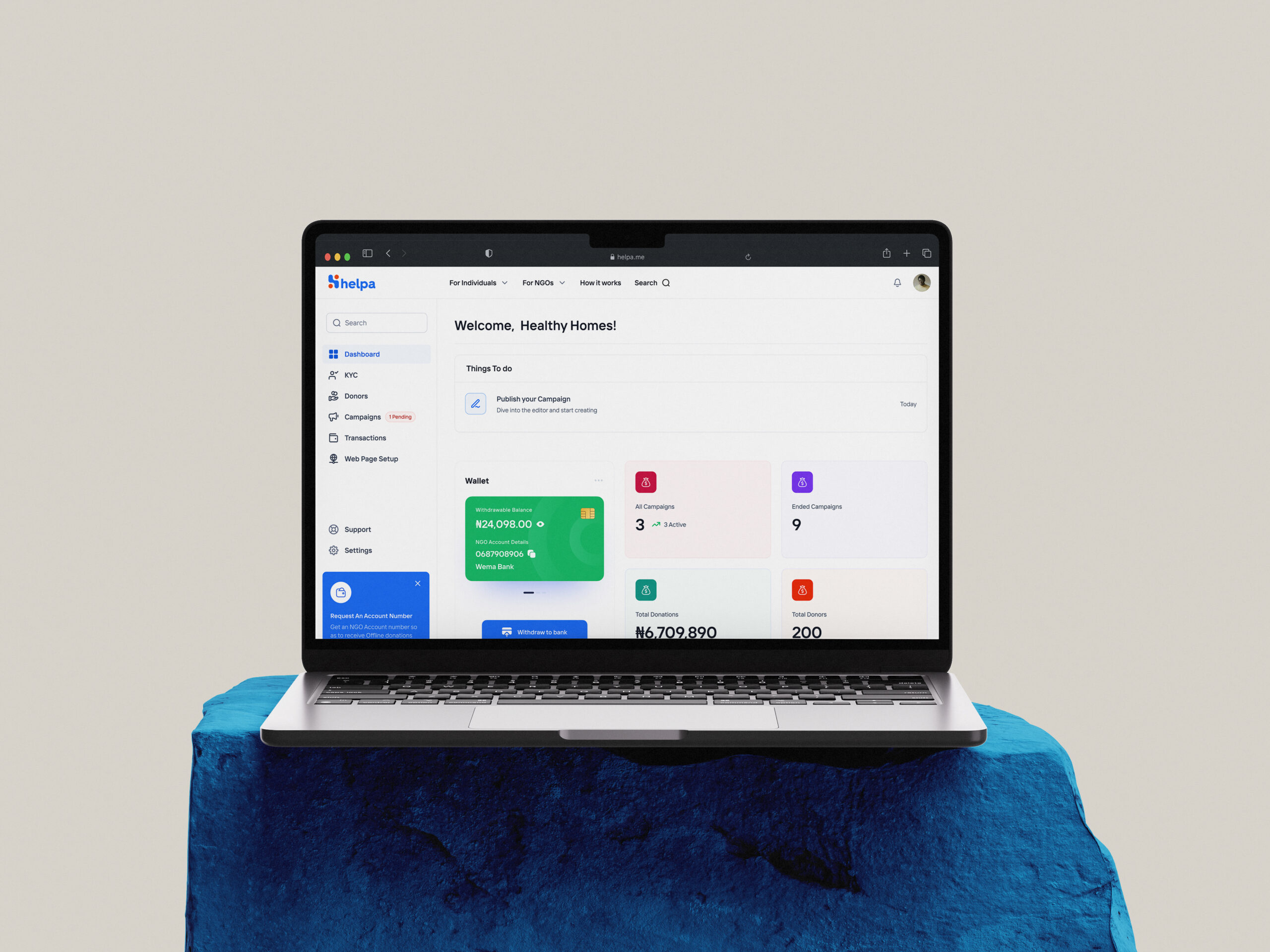
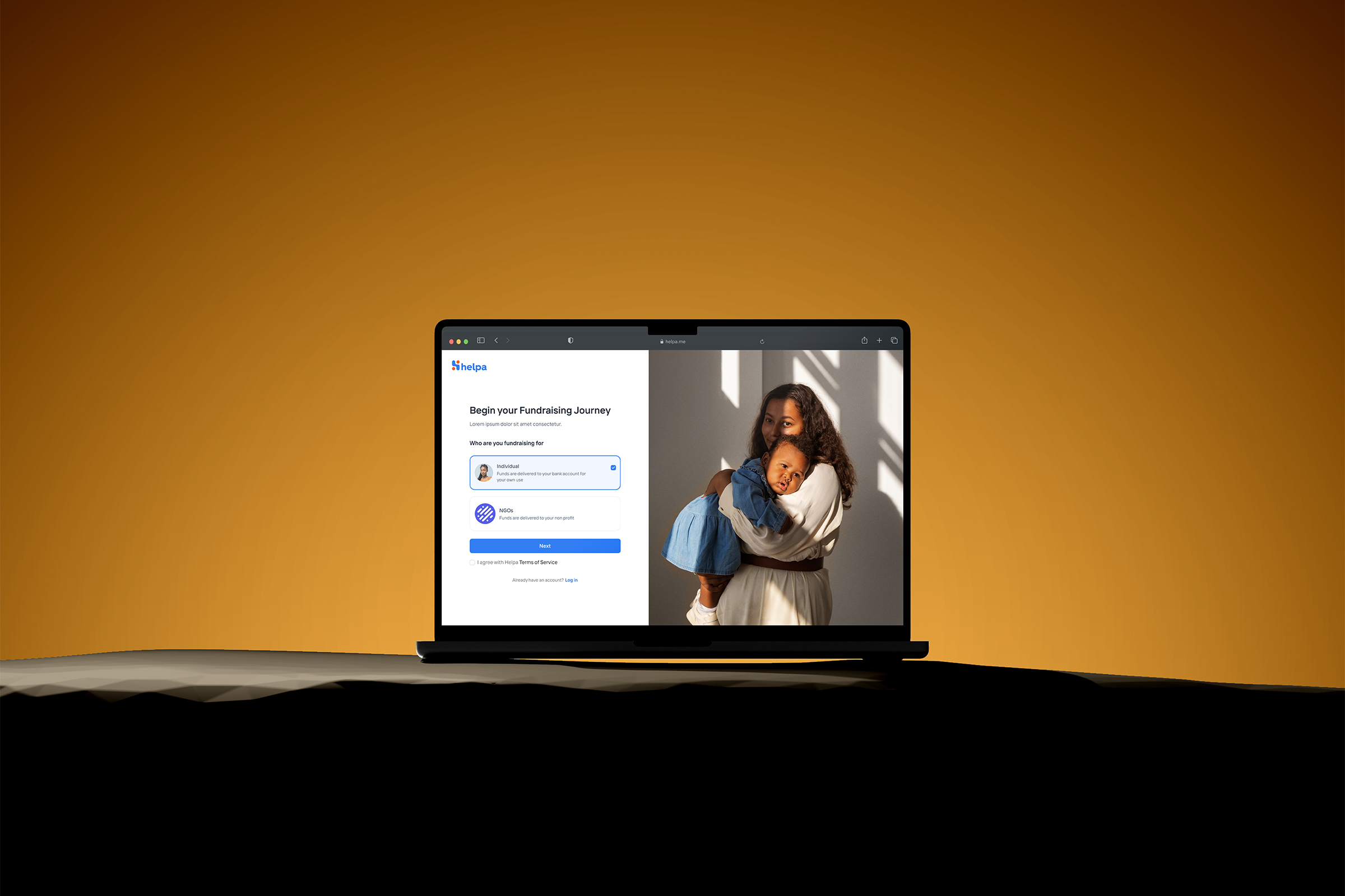
My remit covered more than the public donation flow. I worked across campaign creation, donor checkout, NGO tools, affiliate workflows, and internal administration. The challenge was to make those connected parts feel like one dependable product.
Where confidence broke
The donor-facing problem looked like checkout abandonment, but the uncertainty started earlier. Campaign stories were not always clear enough, credibility cues did not do enough work, and mobile donors had to make too many decisions before completing a payment.
The same gaps appeared behind the scenes. Campaign owners needed better guidance, while NGO and admin teams were working through tools whose structure did not match their responsibilities. Improving only the payment screen would have left the larger confidence problem untouched.
- Donors needed enough information to decide whether a campaign was credible.
- Campaign owners needed help explaining a medical situation clearly.
- Mobile giving needed fewer avoidable steps and clearer payment feedback.
- Operations teams needed focused tools for verification, support, and oversight.
One product, five roles
I mapped the product around five groups and the job each one needed to complete. The aim was not to give everyone the same dashboard. It was to give each role a focused view while keeping shared patterns, language, and campaign states consistent across the system.
Donors
Understand a medical need, judge its credibility, and give without unnecessary friction.
Campaign owners
Tell the story clearly, provide supporting information, publish, and follow progress.
NGOs
Manage the campaigns they support through a recognisable public presence.
Affiliates
Refer campaigns and understand the activity linked to their work.
Internal admins
Verify campaigns, support users, monitor activity, and resolve issues.
Campaigns people could believe
I strengthened the campaign page around the questions a donor needed answered before giving: who needed help, what the money was for, how much had been raised, and why the request was credible.
Campaign owners also needed a better starting point. The AI-assisted story feature used guided prompts to help them turn fragmented medical details into a clearer narrative. It supported the writing process; the owner still controlled what was published.
- Put the medical need and funding context before the donation action.
- Use progress, verification, and campaign details as information—not decoration.
- Guide owners through the story instead of confronting them with a blank editor.
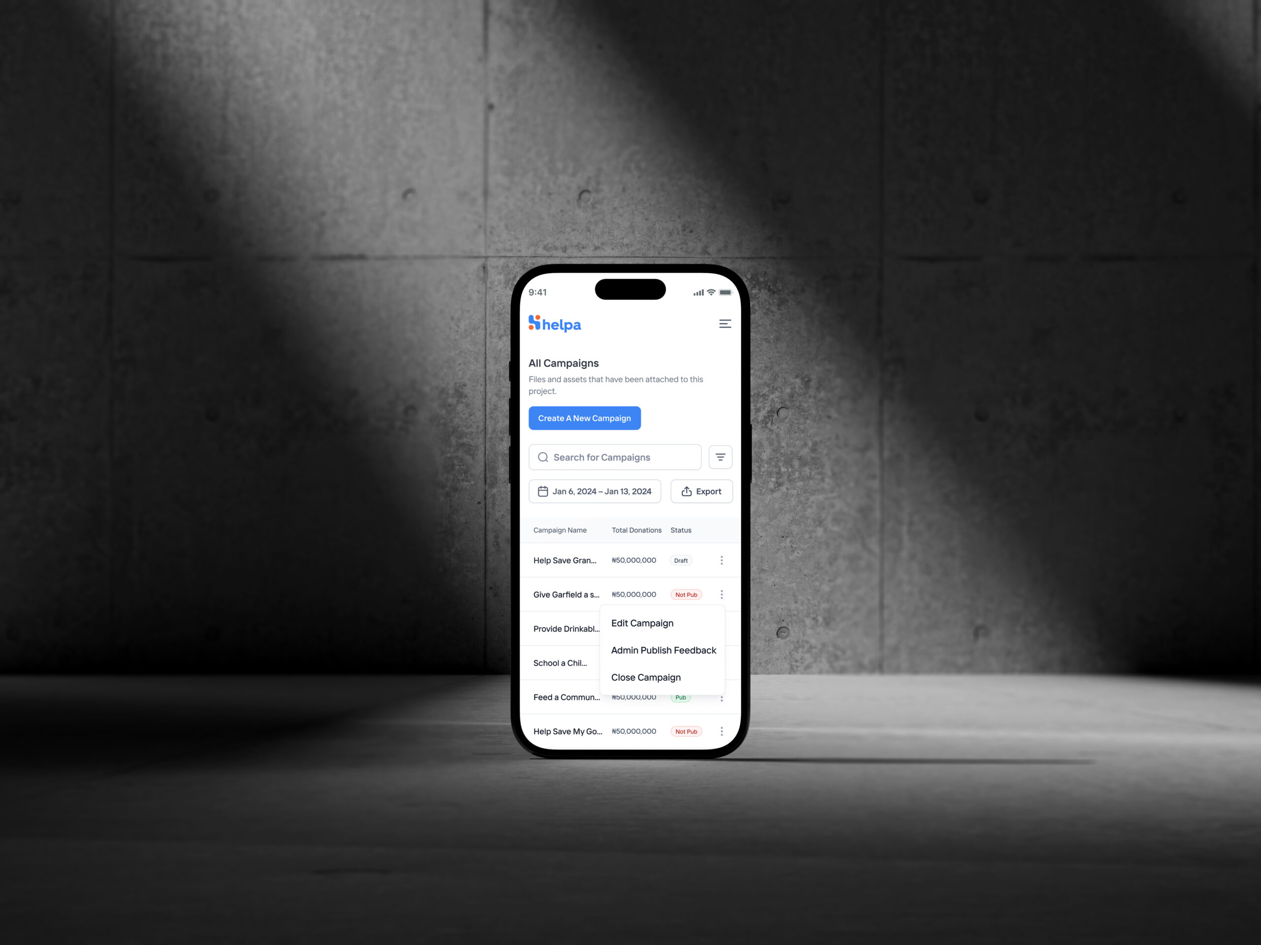
- Keep draft, review, and published states clear on mobile.
A shorter path to giving
Mobile checkout was the clearest conversion problem, so I treated it as a focused journey rather than an extension of the desktop form. The revised flow reduced avoidable decisions, kept the campaign context visible, and made payment progress and failure states easier to understand.
I tested the mobile donation path at low fidelity before moving into production detail. The useful question was simple: could someone move from deciding to give to knowing the payment outcome without needing an explanation?
- Keep amount selection and payment in one coherent sequence.
- Remove secondary choices that did not help someone complete the donation.
- Make success, failure, and retry states unmistakable.
- Preserve the campaign destination throughout the payment journey.
Operations behind the promise
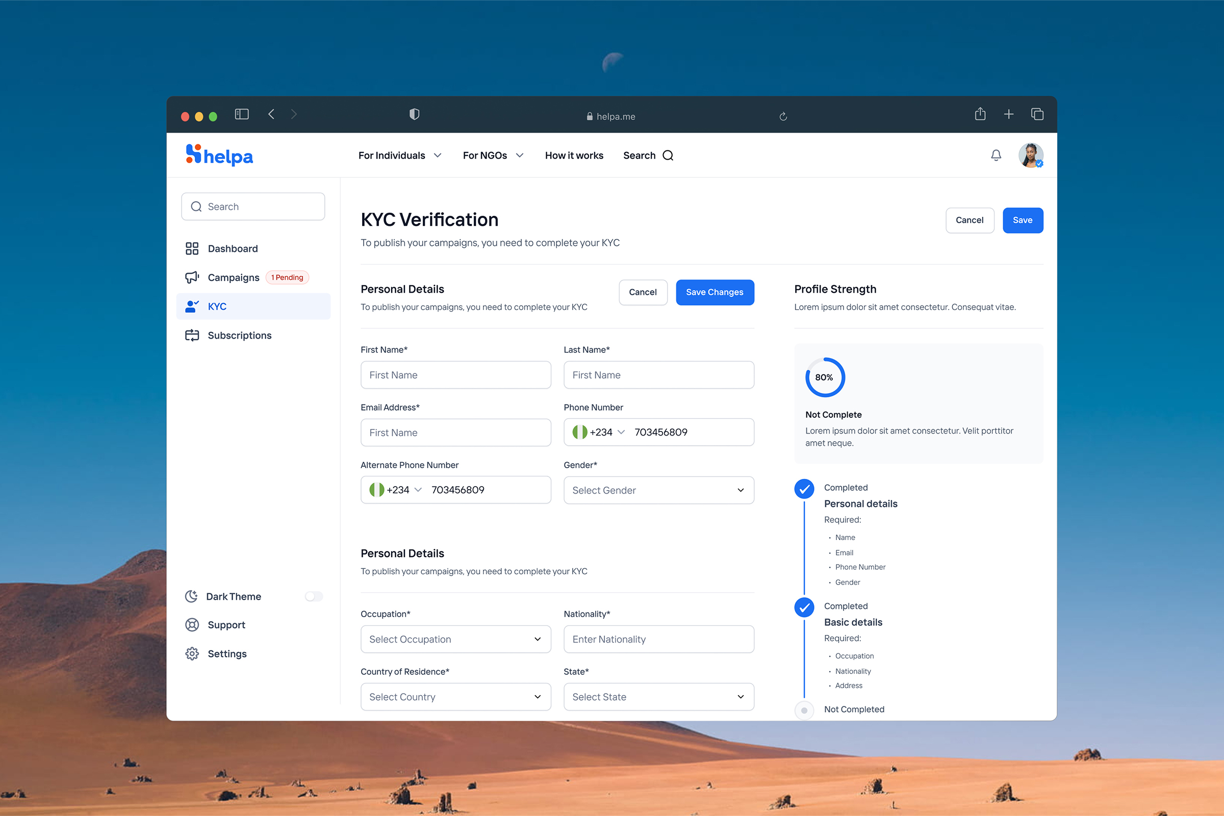
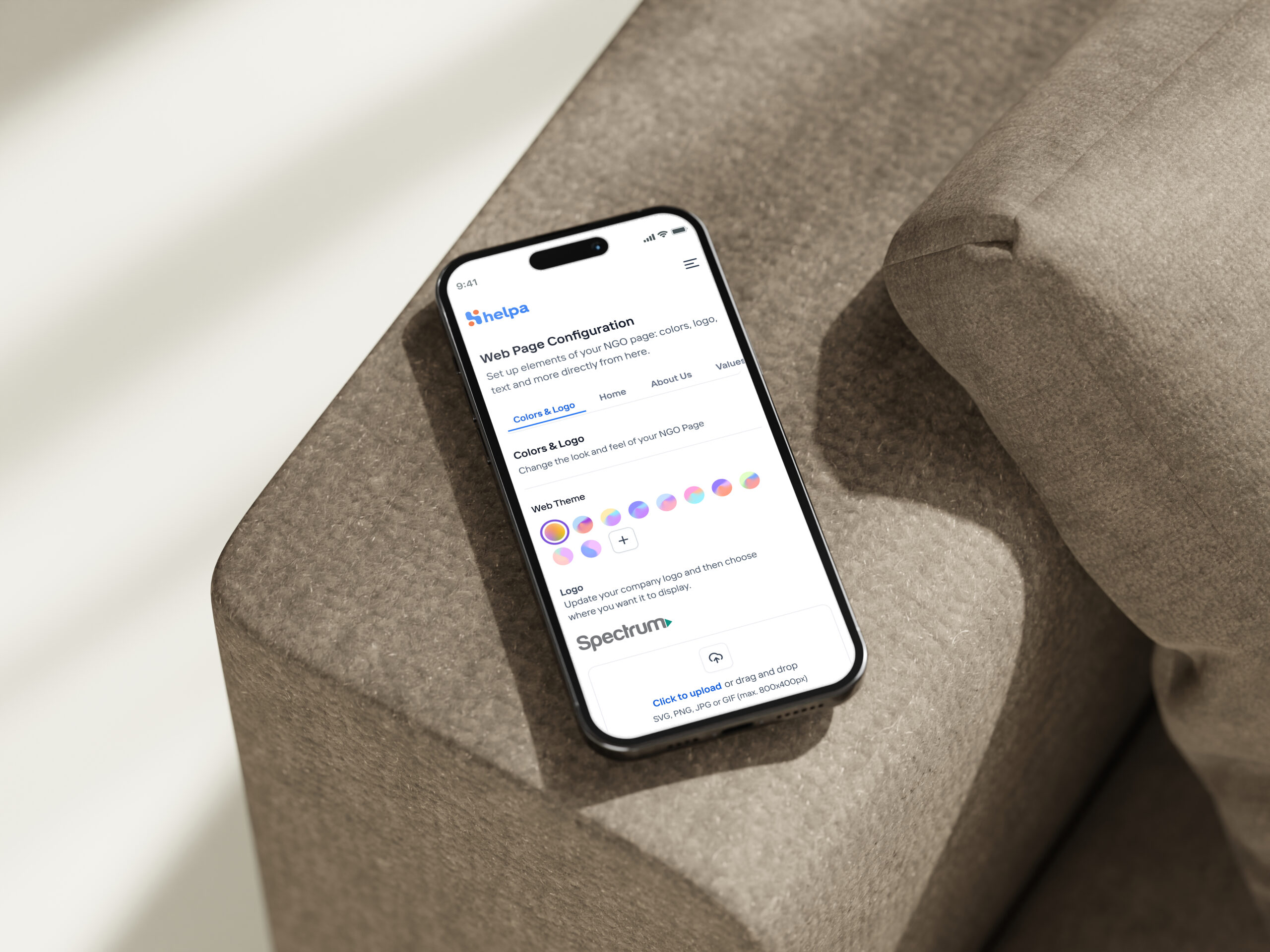
A trustworthy campaign also depends on work the donor never sees. I reorganised the role-based portals so verification, campaign status, NGO configuration, reporting, and support actions were easier to find and act on.
The portals remained different where the work was different, but reused the same navigation logic, statuses, and interaction patterns. That helped Helpa feel like one product rather than a collection of admin screens.
Reported product outcomes
What changed
The redesign connected stronger campaign stories, a clearer mobile donation path, and more focused operations. The product went on to report meaningful movement in both fundraising and completion behaviour.
₦500M+
Fundraising facilitated
Raised through campaigns supported by the platform.
40%
Larger average donation
Reported after the assisted campaign-story feature launched.
25%
Lower checkout abandonment
Reported after the mobile donation-flow redesign.
Looking back
Helpa.Me changed how I think about trust-heavy products. The donor sees a campaign and a payment flow, but confidence is also shaped by the quality of the story, the verification process, the clarity of campaign states, and the people operating the platform behind the scenes.
The strongest design decision was to treat those surfaces as one connected product. If I were documenting the work again, I would preserve the raw usability notes and instrument the trust steps more deliberately. The lesson still holds: a simpler donor experience begins with resolving complexity elsewhere in the system.